“Demography is destiny” or “it’s all about reproduction”.
World’s most important graph according to Steve Sailer:
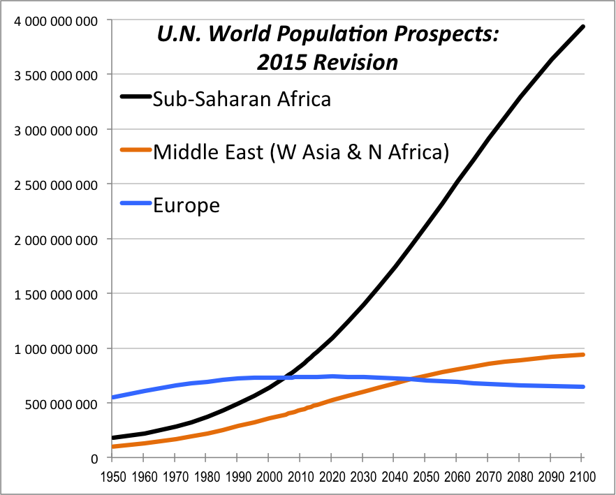
Sub Saharan Africa growth projected to double from 1.1 billion in 2013 to 2.4 billion in 2050 according to the Population Reference Bureau
It’s not just number of children per woman that is often referenced, but generation time, mortality, and even levels of altruism within a hosting population.
Let’s write a shiny app that will allow us to gain some insight by manipulating the relevant variables. The equations useful for estimates can be found in your population genetics textbook. I will use a simplified method of calculating population growth outlined by Wahl and DeHaan (2004). This simplified model will ignore complicating variables such as birth of males, gestation time and staggered births. Essentially I will be treating humans as dividing bacteria. Though a simplified model, you can still gain a sense of the synergism between generation time and fecundity.
In this model, the number of offspring N after some number of generations G given fecundtity (number of offspring per woman) F is:
$$N=F^G$$
I will fix the starting populations at 10 and perform calculations for 200 years, enough to get a feel for what our grandchildren might experience.
1 | t <- seq(20, 200, by=20) ##t is in years |
t (time in years) will serve as the abcissa of my plot.
The terminology I will use in the app is “Host” (suffix h; also called population 1, or p1) for the population accepting immigrants, and “Invaders” (suffix i; population 2 or p2) as the population of immigrants. To build your mental model, consider the host country something like America, and the immigrant source country some subsaharan country unconcerned with population growth and unaware of the concept of limited resources.
The growth equations:
1 | x.h <- p1f^(t/p1g) |
p1f (fecundity) and p1g (generation time) hold input from the sliders. Consider the power t/p1g. If t is 20 years, and the input p1g is 20 years, 20/20 = 1 generation.
Next set up the plot. As it is difficult to get a sense of the magnitude of the differences generated with slider input, I want to calculate the difference in population size after 200 years and print that as annotation on the plot.
1 | delta <- format(abs( x.h[10] - x.i[10] ), scientific=TRUE, digits=3) |
Consider a mixed population with equal numbers of Hosts and Invaders (10 each) after 200 years with equal fecundity (2) and a generation time of 20 years for the host, 15 years for the invaders. After 200 years the invaders outnumber hosts 10:1. It’s all downhill from there.
The app is hosted at shinyapps.io
Code is available on github