Behavioral epistasis

A recent paper Social Epistasis Amplifies the Fitness Costs of Deleterious Mutations, Engendering Rapid Fitness Decline Among Modernized Populations provides a mathematical model to show the effects of behaviour of a subpopulation (carriers with behavioral mutations) on the total population. I was interested in playing with the parameters and so created a shiny app that would allow me to do so.

Assume co-mingling of a wild type population pop1 with a carrier population pop2. pop2 has deleterious behavioural mutation(s) that affect pop1 via social epistasis. Example behaviors that might have a negative impact on the population might be extreme altruism or free riding. The following equations from the paper describe the population growth of the two intermixed populations.

Population 1 (wild type) growth rate: $$pop1_{t+1} - pop1_t = (1 - p_{12})*birthrate1(pop1_t, pop2_t)*pop1_t - deathrate1*pop1_t$$ Population 2 (carrier) growth rate: $$pop2_{t+1} - pop2_t = birthrate2 * pop2_t - deathrate2 * pop2_t + p_{12} * birthrate1(pop1_t,pop2_t) * pop1_t$$ Birth rate of population 1: $$birthrate1(pop1_t, pop2_t) = birthsmax1* \frac{pop1_t}{pop1_t + pop2_t}$$

To convert this to R code I utilize a vector indexed by the variable i which will represent the flow of time in generations. pop1[1] is the first generation, pop[2] the second etc. and more generally pop1[i] is followed by pop[i+1]. Likewise birthrate1, which is population size dependent, will be indexed by i, with a potentially unique value for each generation.

Start by defining variables and setting their values to the defaults used in the paper. pop 1 and 2 will be vectors

1
2
3
4
5
6
7
8
9
10
11
12
13

birthrate2 <- 1
birthsmax1 <- 1.7 ##maximum birth rate
deathrate1 <- 1
deathrate2 <- 1.2
gens <- 30 ##number of generations
p12 <- 0.2 ##proportion of carrier births

pop1 <- vector( mode="integer", length=gens) ## wild type
pop2 <- vector( mode="integer", length=gens) ## carriers
birthrate1 <- vector( mode="integer", length=gens)
pop1[1] <- 10 ##initial starting population

Loop over the generations, adjusting population sizes and birthrate1’s value, which is population size dependent.

1
2
3
4
5
6
7

for( i in 1:(gens-1)){
birthrate1[i] <- birthsmax1*( pop1[i]/(pop1[i] + pop2[i]))
pop1[i+1] <- ((1 - p12)*birthrate1[i]*pop1[i] - deathrate1*pop1[i]) + pop1[i] ###wild type
pop2[i+1] <- birthrate2*pop2[i] - deathrate2*pop2[i] + p12*birthrate1[i]*pop1[i] + pop2[i] ##carriers
}

Then plot

1
2
3
4
5
6
7
8

plot(1:gens, pop1, type="l", xlab="Generation", ylab="Population size", main="Assess mutation load")
points(1:gens, pop2, type="l", col="red")
legend(x = 0.75*par("usr")[2], y = 0.75*par("usr")[4],
legend = c("Wild type","Carrier"),
col = c("black","red"),
pch=16)

I would like to make this a Shiny app where I can dynamically change the variables and see the effect in the plot. Take the constants and wrap them into a reactive function. Here is server.R:

server.R
1
2
3
4
5
6
7
8
9
10
11
12
13
14
15
16
17
18
19
20
21
22
23
24
25
26
27
28
29
30
31
32
33
34
35
36
37
38
39
40
41
42
43
44
45
46
47
48
49
50
51
52
53

shinyServer(function(input, output) {

p12func <- reactive({
input$slider1
})
br1maxfunc <- reactive({
input$slider2
})
br2func <- reactive({
input$slider3
})
dr1func <- reactive({
input$slider4
})

dr2func <- reactive({
input$slider5
})
genfunc <- reactive({
input$slider6
})

output$plot1 <- renderPlot({

birthrate2 <- br2func() ## 1
birthsmax1 <- br1maxfunc() ##1.7 maximum birth rate
deathrate1 <- dr1func() ##default 1
deathrate2 <- dr2func() ##1.2
gens <- genfunc() ##30 number of generations
p12 <- p12func() ##proportion of carrier births

pop1 <- vector( mode="integer", length=gens) ## wild type
pop2 <- vector( mode="integer", length=gens) ## carriers

pop1[1] <- 10
birthrate1 <- vector( mode="integer", length=gens)

for( i in 1:(gens-1)){
birthrate1[i] <- birthsmax1*( pop1[i]/(pop1[i] + pop2[i]))
pop1[i+1] <- ((1 - p12)*birthrate1[i]*pop1[i] - deathrate1*pop1[i]) + pop1[i] ###wild type
pop2[i+1] <- birthrate2*pop2[i] - deathrate2*pop2[i] + p12*birthrate1[i]*pop1[i] + pop2[i] ##carriers
}

plot(1:gens, pop1, type="l", xlab="Generation", ylab="Population size", main="Assess mutation load",ylim=c(0, max(max(pop1),max(pop2))))
points(1:gens, pop2, type="l", col="red")
legend(x = 0.75*par("usr")[2], y = 0.75*par("usr")[4],
legend = c("Wild type","Carrier"),
col = c("black","red"),
pch=16)
})
})

And the interface:

ui.R
1
2
3
4
5
6
7
8
9
10
11
12
13
14
15
16
17
18
19
20
21
22
23
24
25
26
27
28
29
30
31
shinyUI(fluidPage(

title = "Assess mutation load",

plotOutput('plot1'),

hr(),

fluidRow(
column(3,
h4("General"),
sliderInput("slider1", label = h3("Proportion of carrier births"), min = 0, max = 1, step=0.1, value = 0.2),
sliderInput("slider6", label = h3("Number of generations"), min = 10, max = 100, value = 30, step=10)

),
column(4, offset = 1,
h4("Population 1 - Wild type"),
sliderInput("slider2", label = h3("Pop1 max birth rate"), min = 1, max = 3, value = 1.7, step=0.1),
sliderInput("slider4", label = h3("Pop1 death rate"), min = 1, max = 3, value = 1, step=0.1)


),
column(4,
h4("Population 2 - carriers"),
sliderInput("slider3", label = h3("Pop2 birth rate"), min = 1, max = 3, value = 1, step=0.1),
sliderInput("slider5", label = h3("Pop2 death rate"), min = 1, max = 3, value = 1.2, step=0.1)
)
)
))


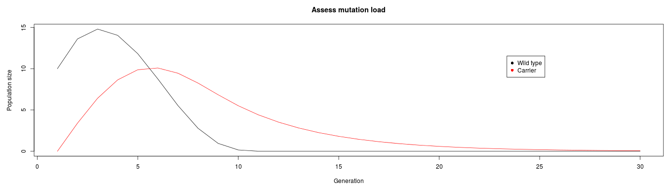
Here is a reproduction of Figure 1 from the paper:

Here is the app on shinyapps.io. There is a monthly limit of free hours on shinyapps.io so you may have to come back if I have surpassed my limit.

Here is John Tooby with some commentary on purifying selection.

Ethnocentrism dominates humanitarianism.

Share