Clinton won the popular vote!??

I am familiar with the popular vote by county map shown here but never have seen it as a bar graph. I downloaded the raw data from here and plotted it myself:

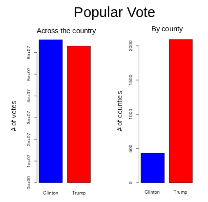
So one must define “popular vote”. If you say popular vote is the candidate most popular across the country, I think I could say Trump won “by a landslide”!! Also a good argument as to why we have the Electoral college. We don’t want liberal concerns (BLM, diversity and inclusion, unconscious bias, feminism, LGBTQ) from the large metropolis’ (packed with undocumented voters) to trump the concerns of most Americans (family values, nationalism, solidarity). Also a good argument for implementing voter identification laws.

process.R
1
2
3
4
5
6
7
8
9
10
11
12
13
14
15
16
17
18
19
20
library(dplyr)
rm(list=ls(all=TRUE))

location <- '~/syncd/prog/county_data'
filename <- paste( "data.csv", sep="")
d <- read.table (file = filename, sep = ",", dec = ".", header=TRUE, skip = 0, na.strings = "NA", strip.white = FALSE )

d$GOPexcess <- d$votes_gop - d$votes_dem
d$winner <- "Trump"

for(i in 1:nrow(d)){
if(d[i,"GOPexcess"] <0) d[i,"winner"] <- "Clinton"
}

barplot(table(d$winner), col=c("blue","red"))
barplot(c("Clinton"= 65853652,"Trump"=62985134) ,col=c("blue","red"))

out.file <- "final.txt"
write.table( final, file =out.file, append = FALSE, quote = TRUE, sep = "\t", eol = "\n", na = "NA", dec = ".", row.names = FALSE, col.names = TRUE, qmethod = c("escape", "double"))

Share